Readable window graphics come down to four decisions: a short message, letters big enough for the distance, strong contrast against what sits behind the glass, and a placement that stays clear of frames, handles, and reflections. Settle those four before you ask anyone for a quote, and the rest of the project gets easier.
Storefront glass is prime real estate. People see it while they walk past, while they park, and while they wait at the door. It is also a tricky surface, because the glass shows reflections, the sun moves, and the view behind it changes by the hour. This guide covers how to plan graphics that hold up on a real window, and what to gather so your quote request is clear from the first message.
Start with one job for the window
A window can carry a business name, store hours, a logo, a phone number, a promotion, or all of them. Readers take in far less than that. Pick the one thing a passerby must learn, and let everything else play a supporting role.
- Who are you? Lead with the business name or logo.
- When can people come in? Lead with store hours, placed where people look for them.
- What are you offering right now? Lead with the offer, and keep the business name smaller.
Finish this sentence: "Someone walking by should know ____ in three seconds." If the answer takes a paragraph, you have more than one sign's worth of content. Cut it down, or split it across separate windows.
Cut the words, then cut again
Most first drafts of window copy run too long. A good working limit is a primary line, a short supporting line, and one way to reach you. A name, a one-line description, and a phone number or web address will cover most shops.
- Use a phone number or one web address, not both, unless you have room to spare.
- Skip lists of every service you offer. Name the category and let customers ask.
- Write hours in a compact, consistent format and check them against what is actually true today.
Size your letters for the viewing distance
Letter height is the most common reason a window graphic fails. Text that looks bold on a laptop screen can disappear from across a parking lot. Start by deciding where your customers will usually see the window from: the sidewalk, a parked car, or the street. Then judge the main message from that spot, not from arm's length. Smaller supporting text can work for people standing near the door.
Once you have a layout, check it at actual size. Print it, or mark the real dimensions with painter's tape on the glass, then walk back to your usual viewing distance and read it. If you squint, the letters need to grow or the message needs to shrink. The shop confirms final sizing during quoting, so treat your mockup as a planning tool.
Two more habits help:
- Give the main line the most size. A clear size difference between the name and the details helps readers know where to start.
- Leave breathing room. Crowded lines of text blur together at a distance. Space between lines and around the edges makes each word easier to read.
Check contrast against the actual glass
Contrast is the difference between your graphic and what shows behind it. On a window, that background changes. Inside, it might be a dark dining room, a bright lobby, or a wall of shelves. Outside, it might be reflected sky, parked cars, or a building across the street.
- Look at the glass at different times of day. Morning and late afternoon light can change what you see in the window.
- Notice what sits directly behind the spot where lettering would go. A busy display behind pale lettering makes it hard to read.
- Choose lettering colors that stand apart from both the glass and the interior. If your brand colors are low in contrast, ask about a version of the logo with a stronger option.
- Take a phone photo of the window in daylight and again after dark if the shop is open in the evening.
Battle-Born Signs & GraphiX LLC offers store-hours graphics, window logos, perforated window film, and frosted vinyl. If a certain look or level of privacy matters to you, mention it and ask how each option behaves on your glass, since each one reads differently.
Place graphics where people look, and where they need to see through
Placement is part of readability. A few planning questions help:
- Eye level. Hours and phone numbers are easiest to find at about eye level near the entrance. Large names can sit higher.
- Door and handle clearance. Keep text away from handles, hinges, and edges where it gets cut off or is hard to read.
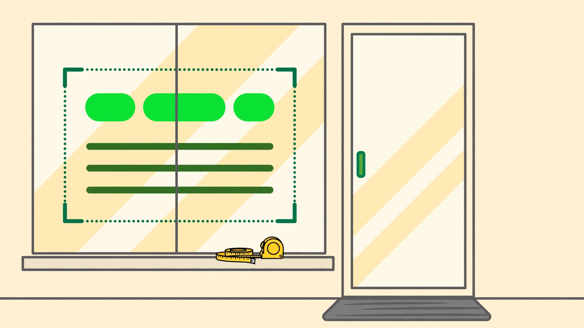
- Frames and dividers. A mullion running through a word splits it. Measure each pane separately, and plan the layout around the dividers.
- Sightlines. Think about what you want people to see through the glass, such as products, seating, or staff, and what you would like to cover.
Check the rules before you commit
If you lease your space, ask your landlord or property manager what they allow on windows and storefronts. Some properties have sign guidelines for tenants. For anything involving local requirements, check with your landlord or the relevant local authority. A quick message before you order can save a redo later.
Pre-quote checklist for window and storefront graphics
You do not need a finished design to ask for a quote. These window-specific details give the shop a strong starting point.
- Pane-by-pane measurements. Width and height of each pane or the area you want covered, plus where each divider, frame, or door edge falls.
- Which side of the glass. Whether the graphic should be read from outside, from inside, or both.
- Graphic type. Store hours, a window logo, perforated film, frosted vinyl, or a custom storefront decal. If you are unsure, describe what you want people to see.
- Glass details. Anything unusual about the glass, such as tint, an existing film, or old lettering that is still on it.
- What sits behind the glass. Dark interior, bright lobby, shelves, or displays, plus how much privacy you want.
- Exact hours and contact wording. Hours, phone number, and address, proofread and checked against what is true today.
- Daylight photos. One straight-on shot of the whole storefront and one close shot of each window, taken in daylight. Add an evening shot if you stay open after dark.
- Usual viewing distance. Whether most people see the window from the sidewalk, the parking area, or across the street.
- Property permission. A note on whether your landlord or property manager has approved window graphics.
Final dimensions, materials, and fit are confirmed with the shop during quoting.
Sketch the layout before you send it
If describing a window in words feels clumsy, try the Sign Designer. You can place text and artwork on a simple board, choose window graphics or storefront decals, and send the layout along with your quote request. It is a visual starting point, not a final proof, and it helps answer questions about size, spacing, and hierarchy.
Ready to send your window details?
Bring whatever you have gathered. Partial measurements and a rough idea are enough to begin. When you are ready, use the quote request form to share your sign type, notes, and artwork. Battle-Born Signs & GraphiX LLC is based in Mohave County, Arizona, and makes its signs and graphics in-house.